ROSSO POMODORO
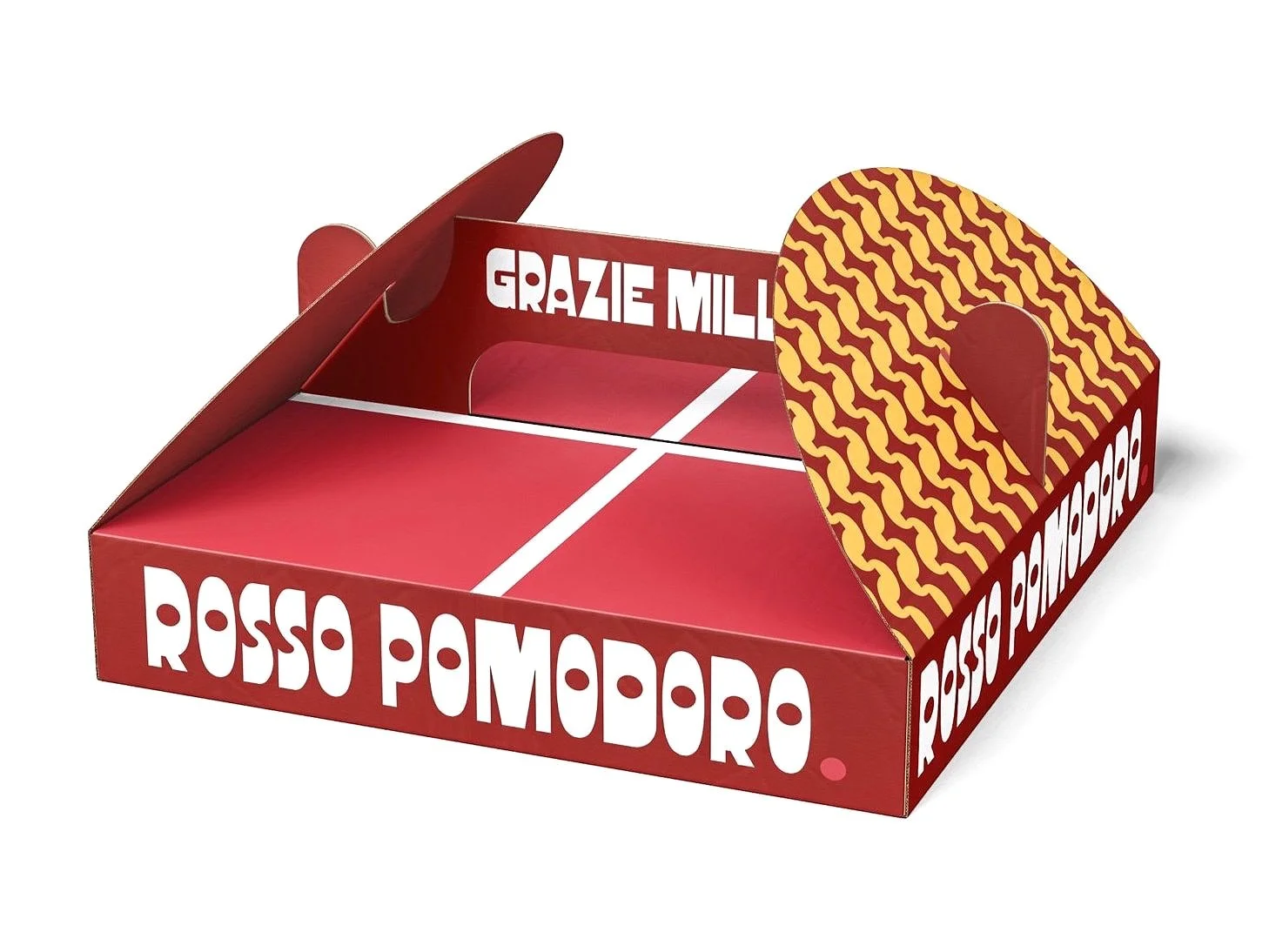
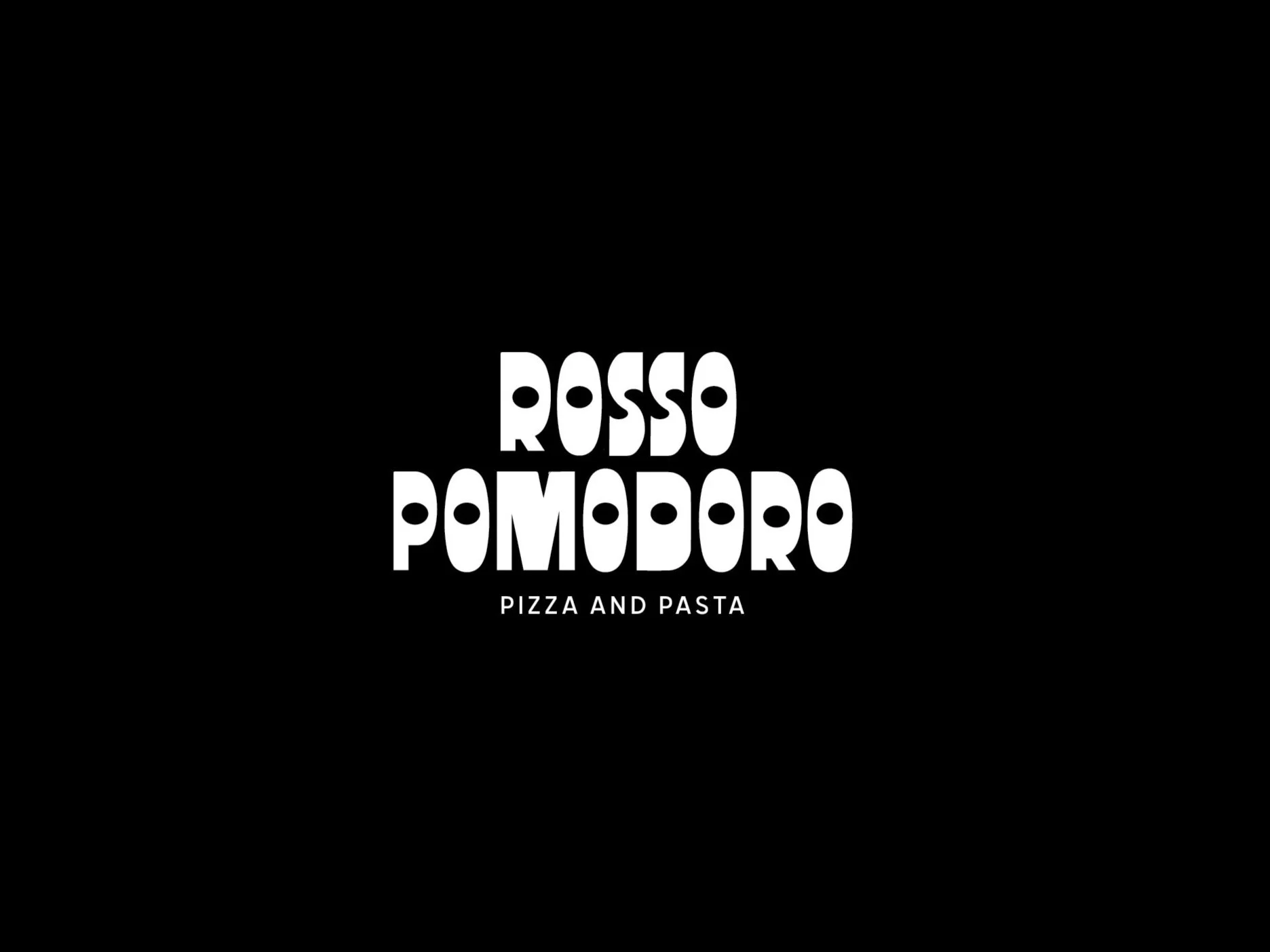
When reimagining the brand mark for Rosso Pomodoro, my goal was to distill the essence of classic Italian charm into a modern, simple and approachable design. The original brand had a strong foundation, but it needed a fresh perspective to resonate with today’s audience while staying true to its roots. Drawing inspiration from retro Italian aesthetics, I crafted a mark that feels both timeless and contemporary—clean, simple, and effortlessly stylish.
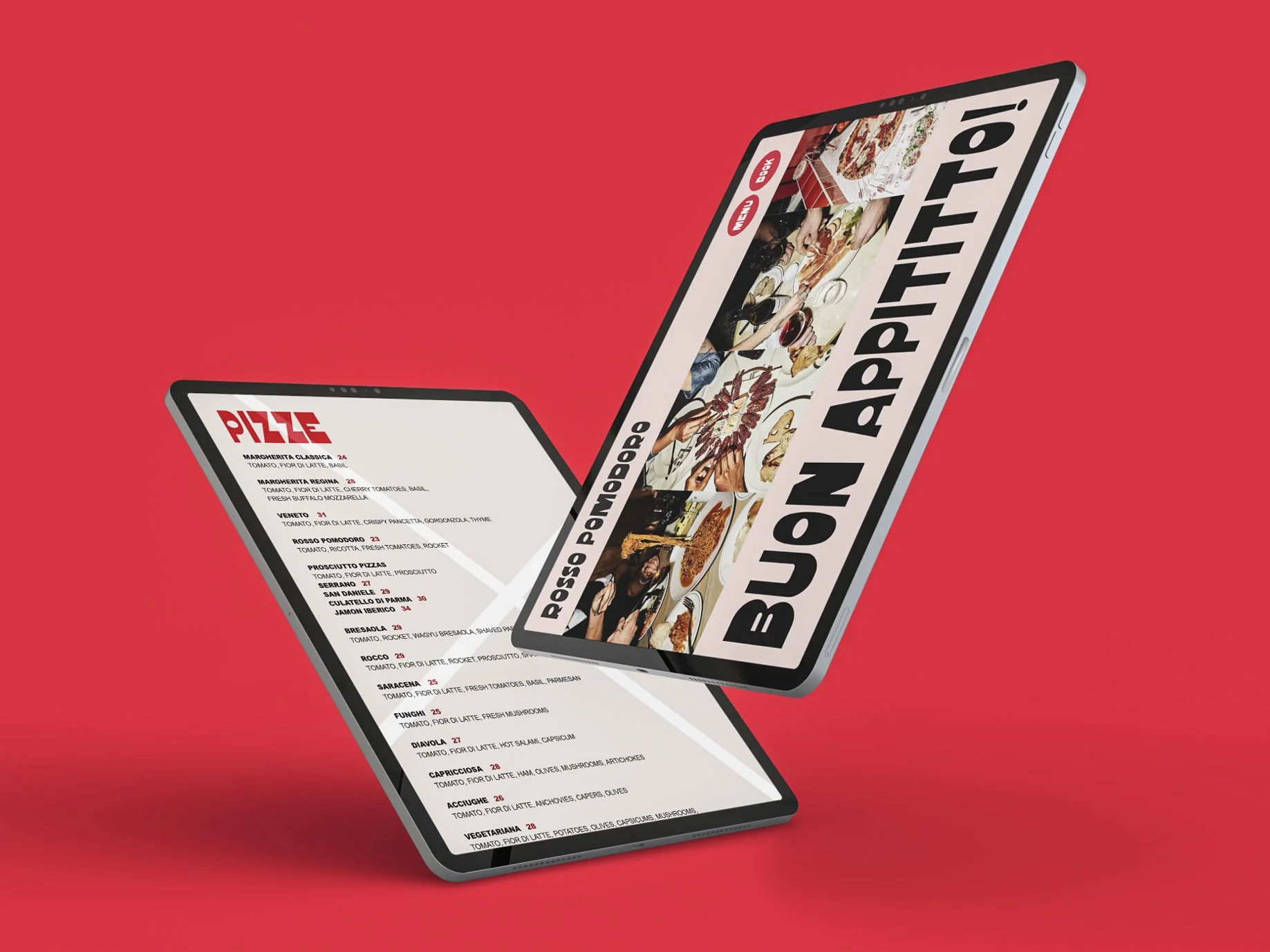
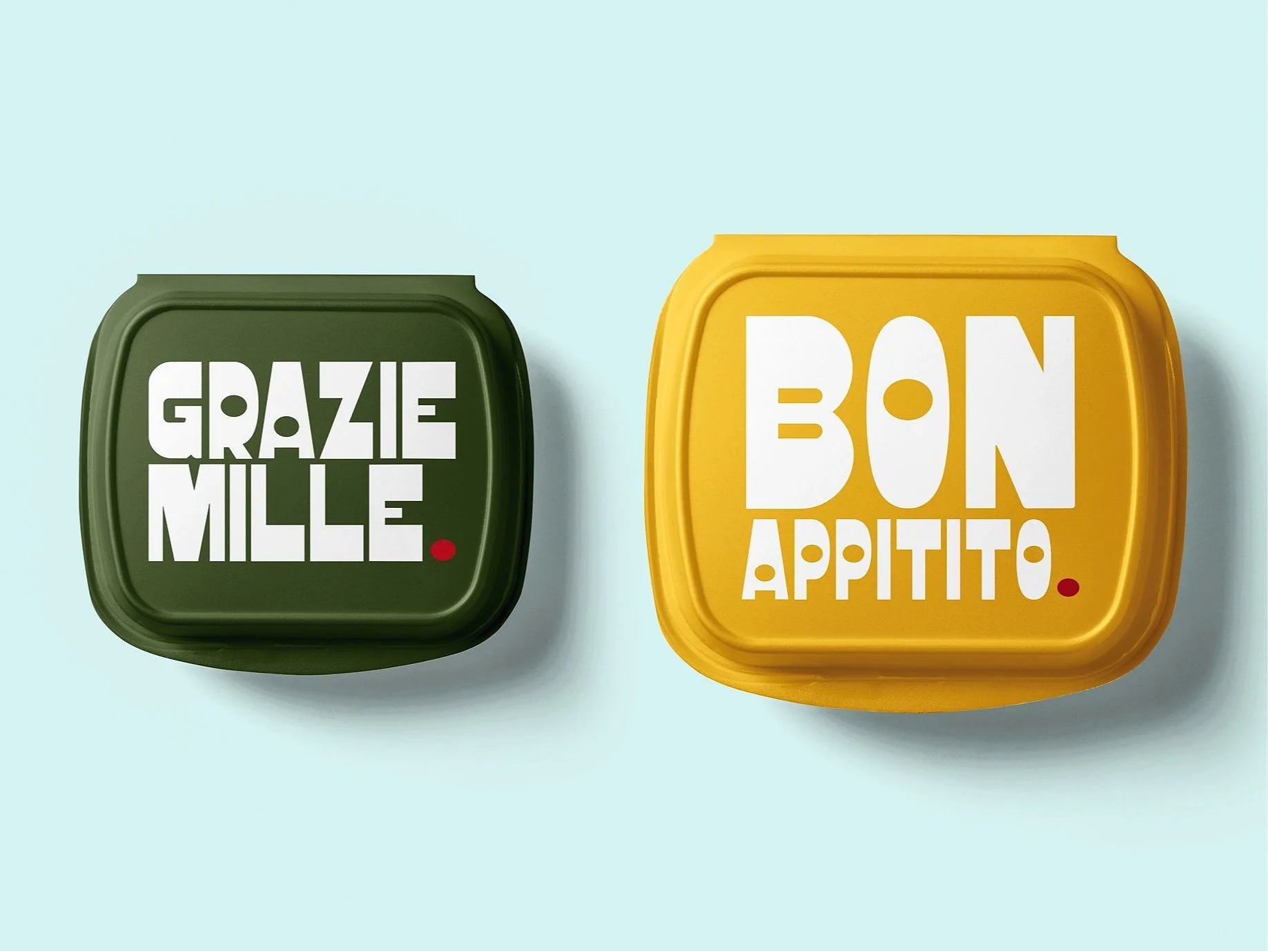
To bring an extra layer of personality to the identity, I incorporated playful elements of Italian conversation into the design. Phrases like “Buon appetito!” and “Mangia, mangia!” add a whimsical touch, inviting customers to feel the lively, welcoming spirit of an Italian trattoria. These conversational cues, combined with the refined visual language, create a brand that celebrates tradition with a sense of fun and warmth. The result is a mark that doesn’t just represent Rosso Pomodoro but invites diners into the heart of its story—where great food and good company always go hand in hand.


